Code
# Load required libraries
library(ggplot2)

# Load the data
url <- "https://tinyurl.com/mtktm8e5"
insurance <- read.csv(url)

# Create an obesity variable
insurance$obese <- ifelse(insurance$bmi >= 30, "obese", "not obese")
Building Complex Graphs Layer by Layer
In this lesson, we’ll explore the power and flexibility of the ggplot2 package in R for creating complex and informative visualizations. ggplot2 is based on the Grammar of Graphics, a layered approach to graph creation that allows for incredible customization and depth.
ggplot2 builds graphs in layers, allowing for great flexibility and customization. This layered approach means you can start simple and progressively add complexity to your visualizations.
First, let’s load the necessary data and create an additional variable.
In this setup phase, we’re doing three crucial things:
# Load required libraries
library(ggplot2)
# Load the data
url <- "https://tinyurl.com/mtktm8e5"
insurance <- read.csv(url)
# Create an obesity variable
insurance$obese <- ifelse(insurance$bmi >= 30, "obese", "not obese")We start with the ggplot() function to specify our dataset and variable mappings.
ggplot(data = insurance,
       mapping = aes(x = age, y = expenses))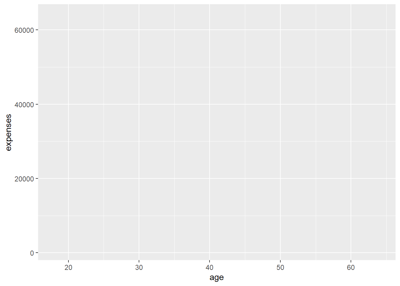
The graph is empty because we haven’t specified what to plot yet!
This function does two main things:
However, at this stage, we haven’t told R what kind of plot to create, which is why the output is an empty graph. Think of this as setting up a blank canvas and defining the coordinate system.
Let’s add points to create a scatterplot
ggplot(data = insurance,
       mapping = aes(x = age, y = expenses)) +
  geom_point(color = "cornflowerblue",
             alpha = .7,
             size = 2)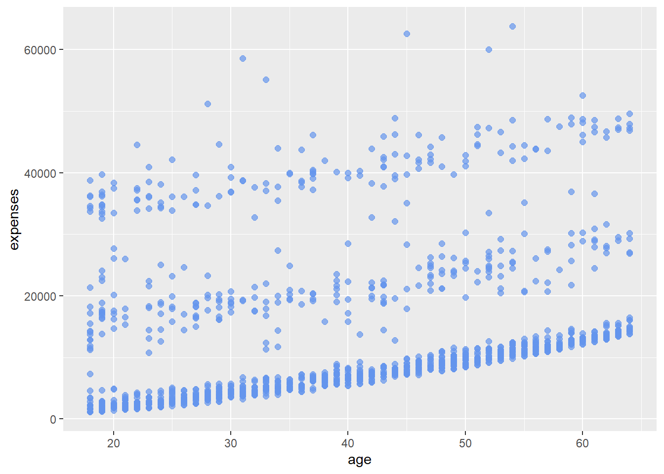
Experiment with different colors, alpha values, and sizes to see how they affect the plot.
Here, we’ve added geom_point(), which tells R to represent each data point as a dot on our graph. This creates a scatterplot, allowing us to see the relationship between age and medical expenses.
The color, alpha, and size parameters within geom_point() allow us to customize the appearance of our points:
Experiment with these values to see how they affect the plot’s appearance and readability.
We can add a line of best fit using geom_smooth().
ggplot(data = insurance,
       mapping = aes(x = age, y = expenses)) +
  geom_point(color = "cornflowerblue",
             alpha = .5,
             size = 2) +
  geom_smooth(method = "lm")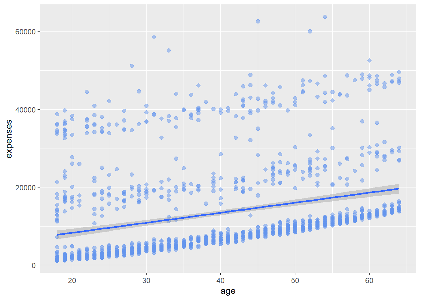
The geom_smooth() function adds a smoothed conditional mean. By specifying method = “lm”, we’re telling R to use a linear model, effectively adding a straight line of best fit to our scatter plot.
This line helps us visualize the general trend: as age increases, medical expenses tend to increase as well.
Let’s differentiate smokers and non-smokers using color.
ggplot(data = insurance,
       mapping = aes(x = age,
                     y = expenses,
                     color = smoker)) +
  geom_point(alpha = .5,
             size = 2) +
  geom_smooth(method = "lm",
              se = FALSE,
              size = 1.5)
Warning: Using `size` aesthetic for lines was deprecated in ggplot2 3.4.0.
ℹ Please use `linewidth` instead.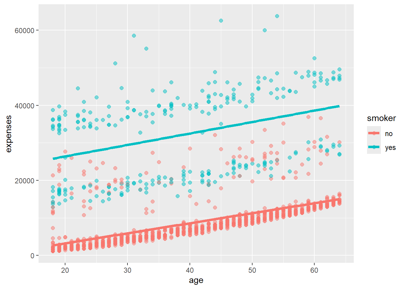
By adding color = smoker to our aesthetic mapping, we’re telling ggplot to use different colors for smokers and non-smokers. This allows us to see not only how age relates to expenses, but also how smoking status influences this relationship.
Notice how ggplot automatically creates a legend for us, explaining what the colors represent.
We can modify axis scales and color schemes.
ggplot(data = insurance,
       mapping = aes(x = age,
                     y = expenses,
                     color = smoker)) +
  geom_point(alpha = .5,
             size = 2) +
  geom_smooth(method = "lm",
              se = FALSE,
              size = 1.5) +
  scale_x_continuous(breaks = seq(0, 70, 10)) +
  scale_y_continuous(breaks = seq(0, 60000, 20000),
                     label = scales::dollar) +
  scale_color_manual(values = c("indianred3",
                                "cornflowerblue"))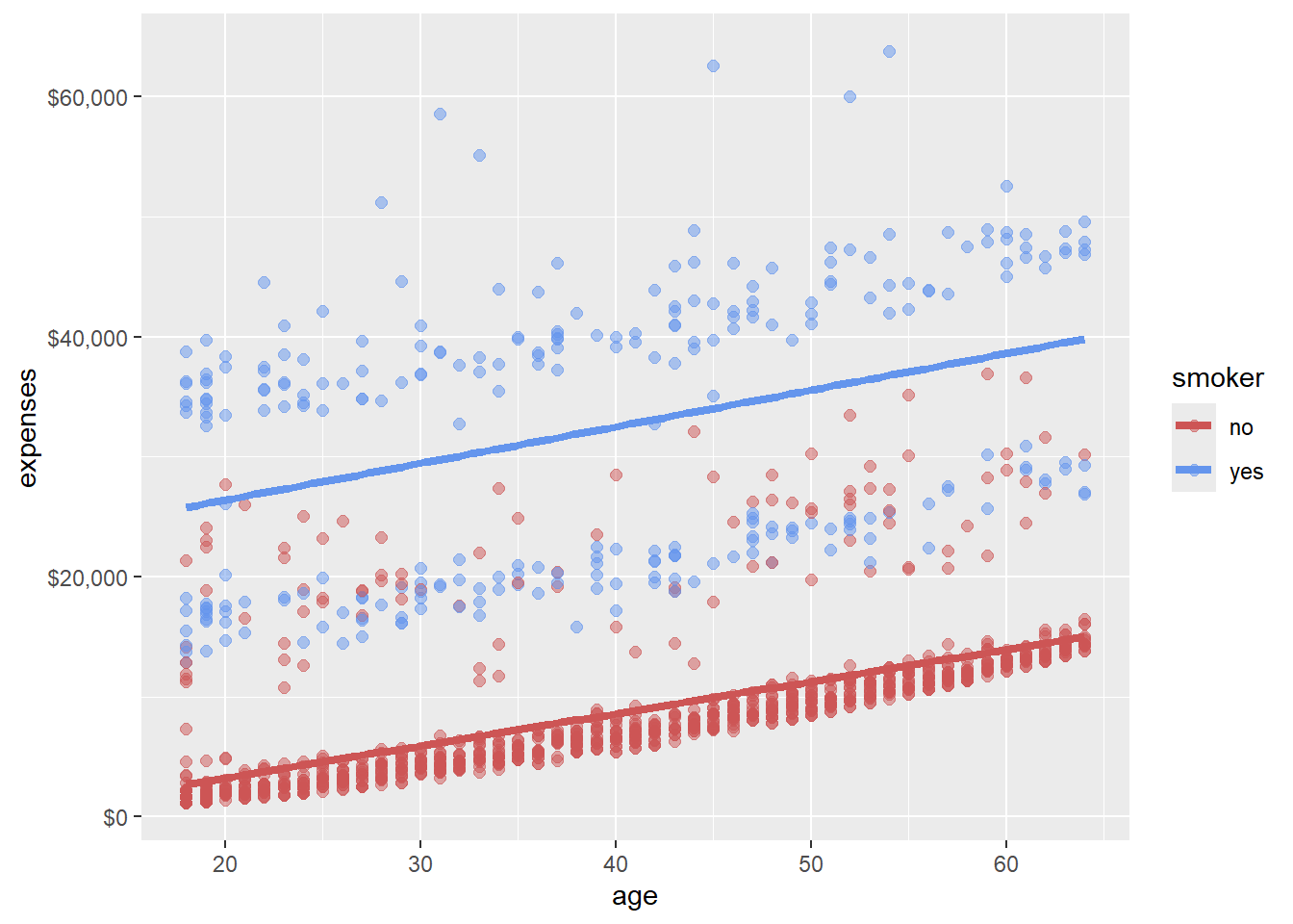
Here, we’ve made several improvements:
These customizations make our graph more accessible and easier to interpret at a glance.
We can create separate plots for obese and non-obese individuals.
ggplot(data = insurance,
       mapping = aes(x = age,
                     y = expenses,
                     color = smoker)) +
  geom_point(alpha = .5) +
  geom_smooth(method = "lm",
              se = FALSE) +
  scale_x_continuous(breaks = seq(0, 70, 10)) +
  scale_y_continuous(breaks = seq(0, 60000, 20000),
                     label = scales::dollar) +
  scale_color_manual(values = c("indianred3",
                                "cornflowerblue")) +
  facet_wrap(~obese)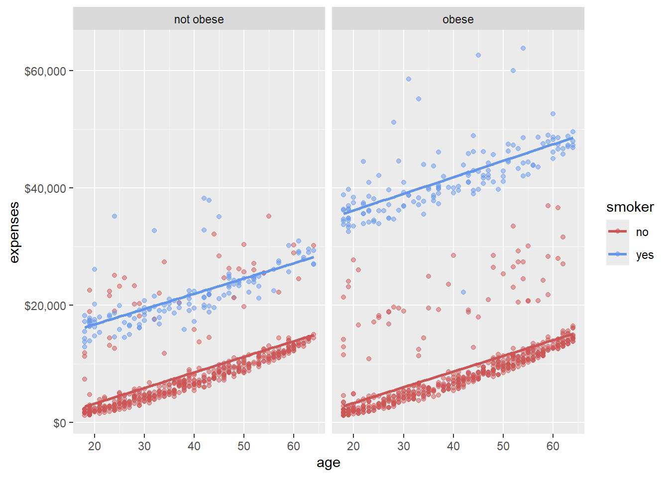
The facet_wrap(~obese) function splits our plot into two based on obesity status. This allows us to compare the age-expense relationship and the impact of smoking across obese and non-obese groups.
This is a powerful way to visualize interactions between multiple variables.
Clear labels make our graph more informative.
ggplot(data = insurance,
       mapping = aes(x = age,
                     y = expenses,
                     color = smoker)) +
  geom_point(alpha = .5) +
  geom_smooth(method = "lm",
              se = FALSE) +
  scale_x_continuous(breaks = seq(0, 70, 10)) +
  scale_y_continuous(breaks = seq(0, 60000, 20000),
                     label = scales::dollar) +
  scale_color_manual(values = c("indianred3",
                                "cornflowerblue")) +
  facet_wrap(~obese) +
  labs(title = "Relationship between patient demographics and medical costs",
       subtitle = "US Census Bureau 2013",
       caption = "source: http://mosaic-web.org/",
       x = " Age (years)",
       y = "Annual expenses",
       color = "Smoker?")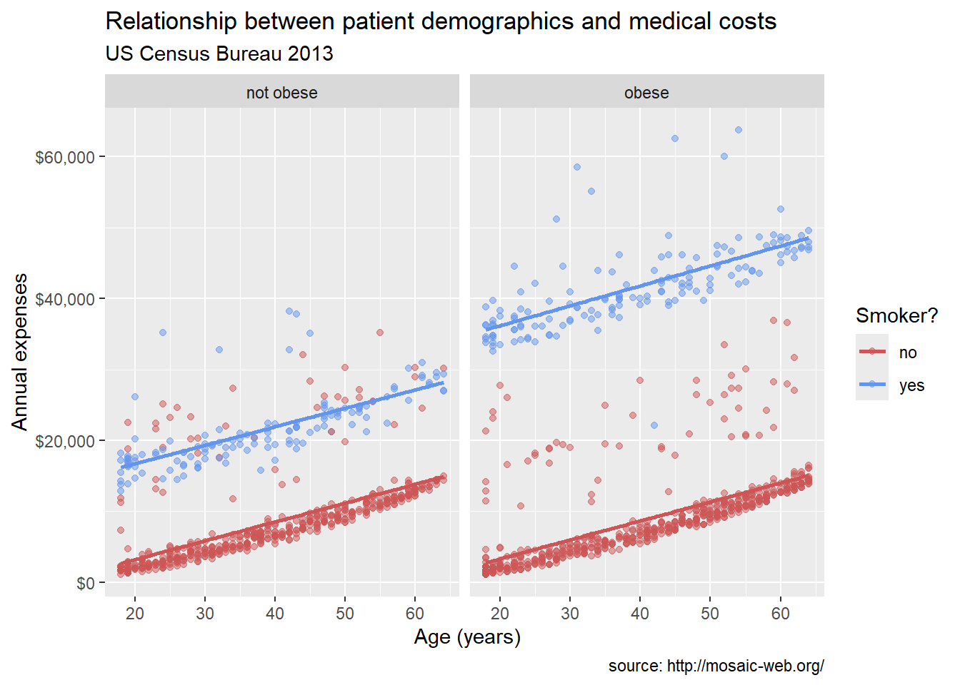
The labs() function allows us to add a title, subtitle, caption, and axis labels. Good labels should explain what the graph is showing and provide context about the data source.
Finally, we can change the overall look of our plot with a theme.
ggplot(data = insurance,
       mapping = aes(x = age,
                     y = expenses,
                     color = smoker)) +
  geom_point(alpha = .5) +
  geom_smooth(method = "lm",
              se = FALSE) +
  scale_x_continuous(breaks = seq(0, 70, 10)) +
  scale_y_continuous(breaks = seq(0, 60000, 20000),
                     label = scales::dollar) +
  scale_color_manual(values = c("indianred3",
                                "cornflowerblue")) +
  facet_wrap(~obese) +
  labs(title = "Relationship between age and medical expenses",
       subtitle = "US Census Data 2013",
       caption = "source: https://github.com/dataspelunking/MLwR",
       x = " Age (years)",
       y = "Medical Expenses",
       color = "Smoker?") +
  theme_minimal()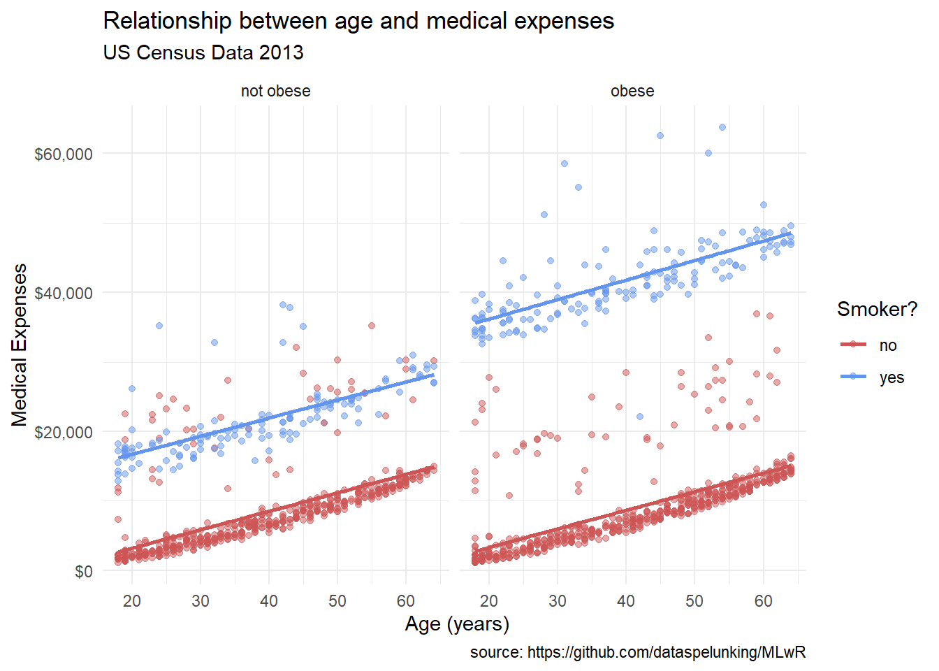
Themes control the non-data elements of the plot, like background color, gridlines, and font sizes. Here, we’ve used theme_minimal() for a clean, modern look. ggplot2 comes with several built-in themes, and you can even create your own custom themes.
We can place mappings in specific geoms instead of the main ggplot() function.
ggplot(insurance,
       aes(x = age,
           y = expenses)) +
  geom_point(aes(color = smoker),
             alpha = .5,
             size = 2) +
  geom_smooth(method = "lm",
              se = FALSE,
              size = 1.5)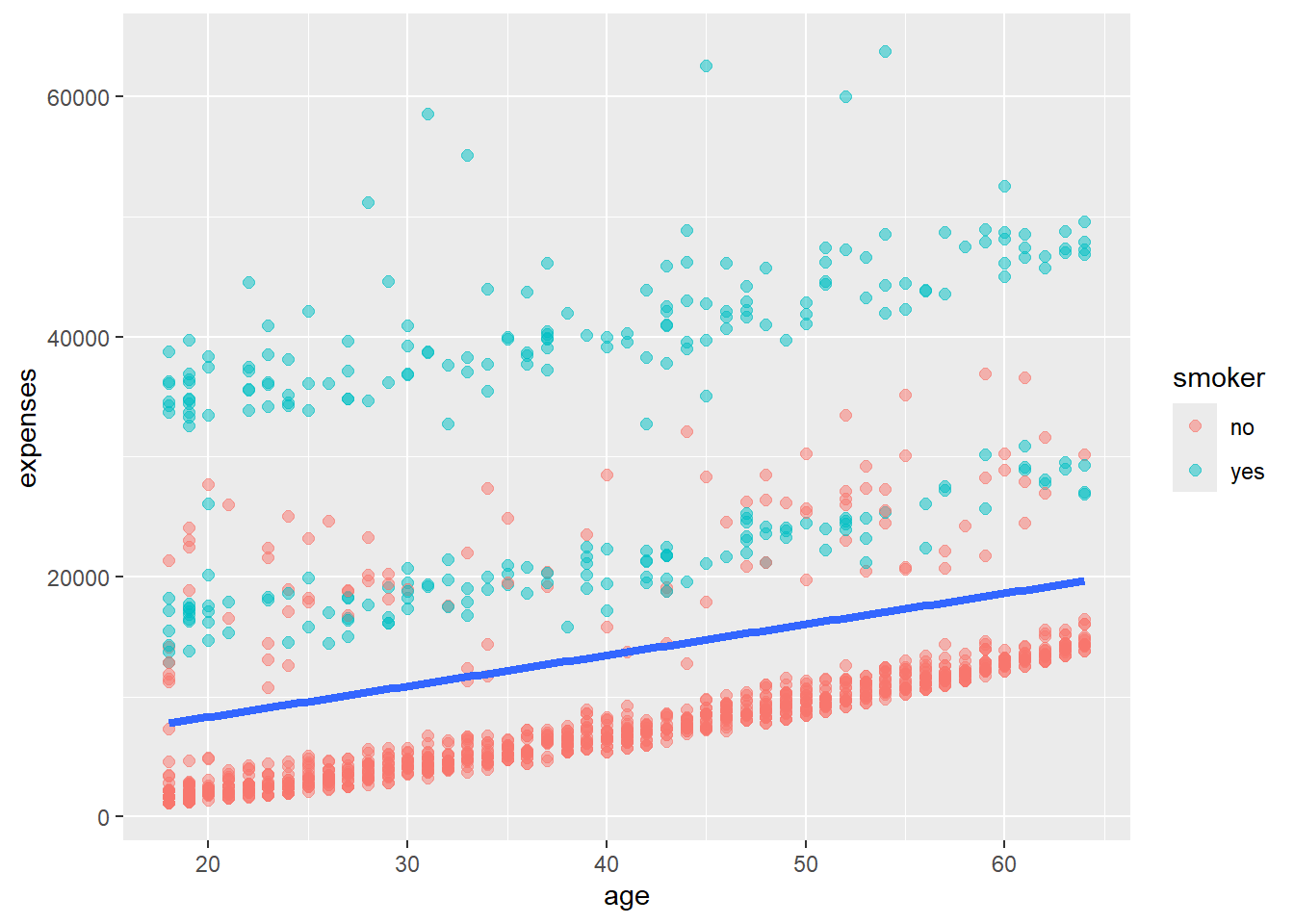
In this example, we’ve moved the color = smoker mapping into geom_point(). This means the color mapping only applies to the points, not to the trend line. This can be useful when you want different aesthetics for different parts of your plot.
We can save graphs as objects for later modification.
# Create and save a basic plot
myplot <- ggplot(data = insurance,
                  aes(x = age, y = expenses)) +
             geom_point()

# Modify and print the plot
myplot <- myplot + geom_point(size = 2, color = "blue")
print(myplot)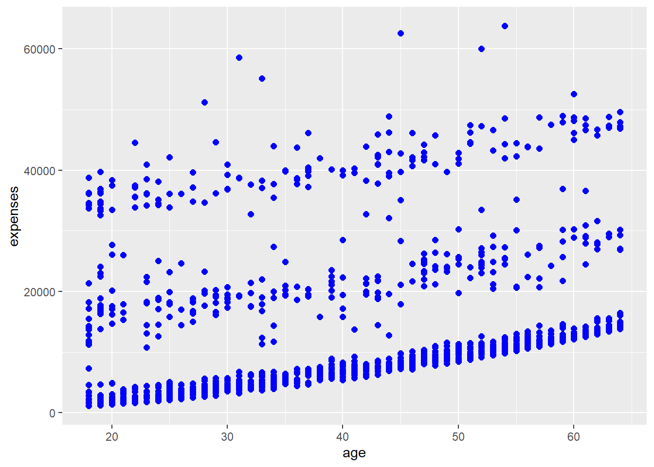
# Add elements without saving
myplot + geom_smooth(method = "lm") +
  labs(title = "Age vs. Expenses")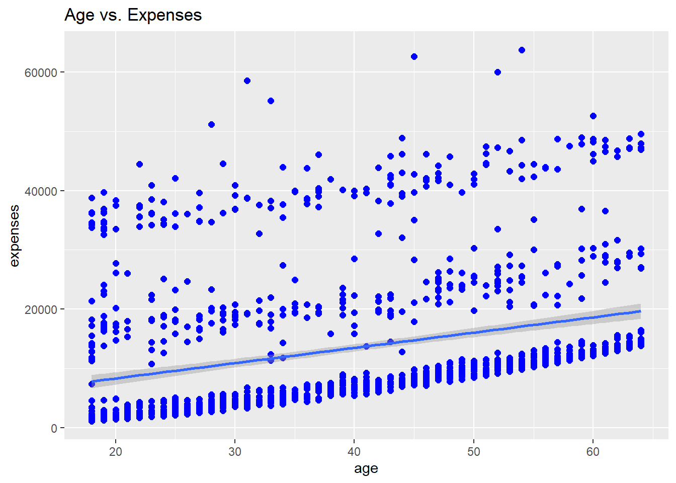
One of the most iconic visualizations in data science is the Gapminder plot, popularized by Hans Rosling. This dynamic plot shows the relationship between GDP per capita and life expectancy across different countries over time. Let’s create this plot step by step, learning some important data visualization concepts along the way.
First, we need to install and load the necessary packages. We’ll use gapminder for the dataset, ggplot2 for creating the base plot, and plotly to make it interactive.
# Load required packages
pacman::p_load(gapminder, ggplot2, plotly, scales)

# Take a look at the data
head(gapminder)
# A tibble: 6 × 6
country continent year lifeExp pop gdpPercap
<fct> <fct> <int> <dbl> <int> <dbl>
1 Afghanistan Asia 1952 28.8 8425333 779.
2 Afghanistan Asia 1957 30.3 9240934 821.
3 Afghanistan Asia 1962 32.0 10267083 853.
4 Afghanistan Asia 1967 34.0 11537966 836.
5 Afghanistan Asia 1972 36.1 13079460 740.
6 Afghanistan Asia 1977 38.4 14880372 786.Let’s examine what this dataset contains:
# Create the base plot
gg <- ggplot(gapminder, aes(gdpPercap, lifeExp, color = continent)) +
    geom_point(aes(size = pop, frame = year, ids = country))

# Display the static plot
gg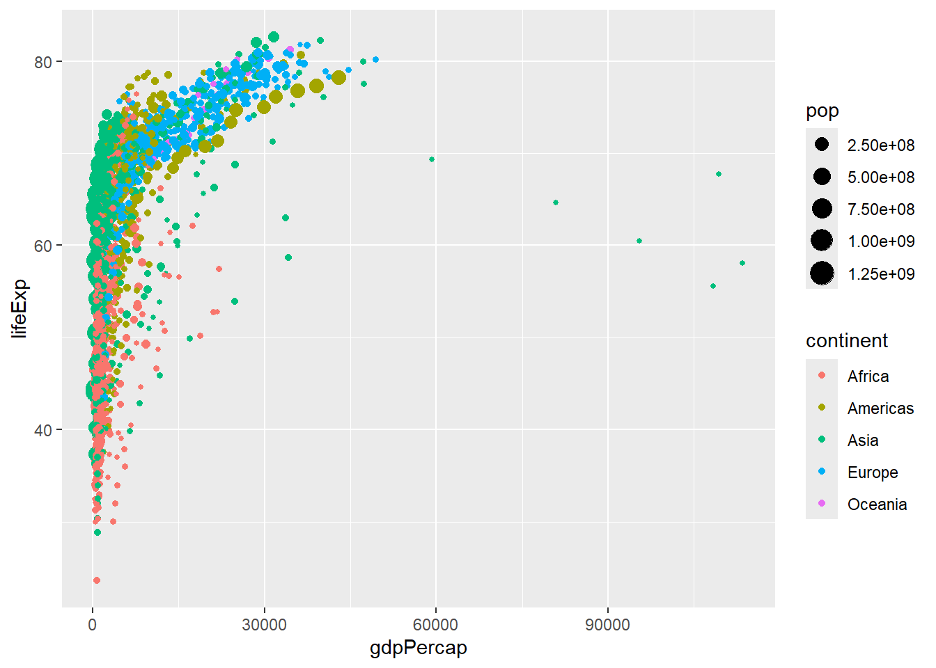
Let’s break down what’s happening here:
ggplot(gapminder, aes(gdpPercap, lifeExp, color = continent)): This sets up the base plot. We’re using GDP per capita for the x-axis, life expectancy for the y-axis, and coloring the points by continent.
geom_point(): This adds points to our plot. Inside aes(), we’re setting:
Now, let’s enhance our plot with some additional features:
# Enhance the plot
gg <- ggplot(gapminder, aes(gdpPercap, lifeExp, color = continent)) +
    geom_point(aes(size = pop, frame = year, ids = country, alpha = 0.3)) +
    scale_x_log10(labels = scales::dollar_format()) +
    labs(title = "Gapminder: GDP per capita vs Life Expectancy",
         x = "GDP per capita",
         y = "Life Expectancy",
         color = "Continent",
         size = "Population") +
    theme_minimal()

# Display the enhanced static plot
gg 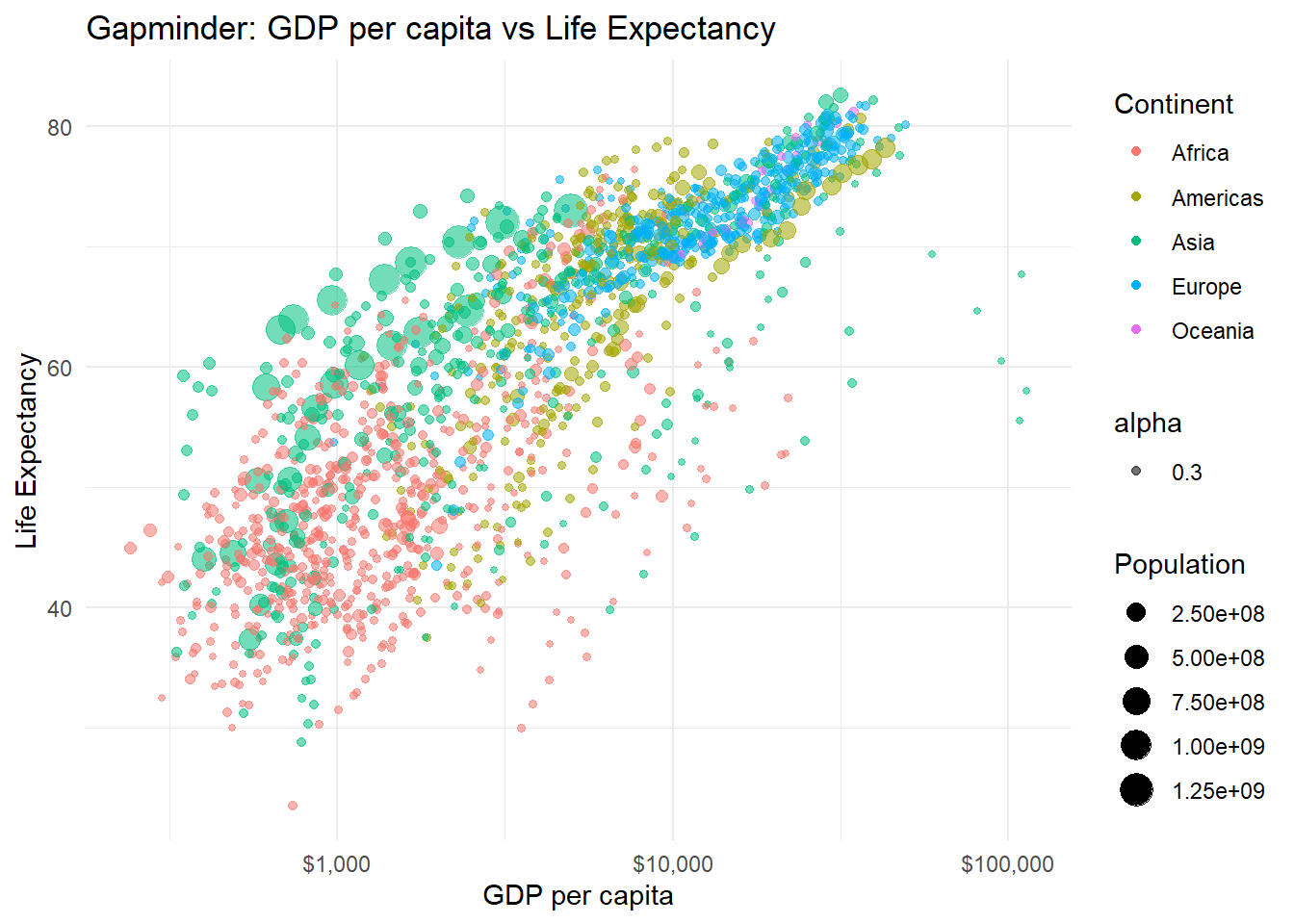
Here’s what we’ve added:
Finally, let’s use plotly to make our plot interactive:
# Create the interactive plot
interactive_plot <- ggplotly(gg)

# Display the interactive plot
interactive_plot
ggplotly() converts our ggplot object into an interactive plotly object. This allows us to:
In this lesson, we’ve walked through the process of creating a complex, informative visualization using ggplot2. We started with a simple scatterplot and progressively added layers of complexity and information.
Remember, the key to mastering ggplot2 is practice and experimentation. Try recreating this plot with different datasets, or explore other geoms and aesthetic mappings. The more you experiment, the more comfortable you’ll become with the grammar of graphics approach.
Exercise - Take another dataset you’re familiar with and try to create a multi-layered plot like the one we’ve built here. Consider what story you want to tell with your data and how you can best visualize that story using the techniques we’ve learned.
By breaking down our graph creation process into these discrete steps, we can create highly customized, publication-quality visualizations that effectively communicate complex data relationships. Happy plotting!